Monday, June 29, 2015

Card Concept #38 Yellow and greys


This is my card for the Card Concept Challenge #38, I am not entirely sure how to classify my card either clean and layered or classy and elegant. But I love these sweet little birds from the Happy Mail stamp set that WPlus9 release earlier this month. 


 I was thinking this would be a great baby shower card. The grey on grey with the birds, flowers, and music notes reminds me of a nursery print. The flowers were colored with a Copic marker and white gel pen.  The banner and the birds were covered with a wink of stella. 

 The two frames the stitched and scalloped frames were cut from Mama Elephant's die cuts and so was the yellow bow.  It's a simple but cute card I would say. Hope that you like my card and leave me some feedback.

Thursday, June 25, 2015

MFT summer school White space lesson

I am trying to learn about good ways to incorporate white space. This is not always easy for me since I don't consider myself a Clean and Simple kind of gal. Sequins are something that I am starting to love and sometimes I tend to over do things and then not be happy with it. For my homework for My Favorite Things summer school I tried to not over do it. 


There is white space and I still have sequins too. This card was really hard to get pictures of that did it justice. My grey panel has wood grain that I stamped with white pigment ink and an embossing folder since I didn't have a woodgrain stamp. 


My vellum flowers have gelatos on the back so the color shows through and they are embossed with silver pearl embossing powder.  When I made this card I started to put a printed piece of paper on the background but then I remembered the lesson about white space and decided that white space looked far better on this card and I could put to use what I had learned. 

Art journal - letters and heart

Today I have an art journal page that has been in the works for awhile. Art journaling is relaxing and a good place to just let lose and be messy. I did something fun with this background that I tried for the first time. After I gessoed my page I put down some distress paint for background color then I got out an embossing folder and dabbed some seedless preserves paint on the raised side and then pressed it on to my page in a random pattern. I think that it turned out pretty cool and I have used this on some other art journal pages and some cards too. 


" I am a little pencil in the hands of a writing God who is sending a love letter to the world." 
 Mother Teresa 


Wednesday, June 24, 2015

Polar bear and northern lights

When I first saw Wplus9's Happy Mail stamp from their June release I fell in love with the bear. He made me think of a polar bear and I knew that I wanted to make a card with him in a polar setting. I figured the best way to create the an Aurora Borealis background was with water colors or distress inks.


For my snow I used white glitter fun foam to add dimension and to give a glittering snow effect. My polar bear was colored with Copics and popped up on foam tape. The sentiment was heat embossed and so were the stripes on the dove grey card stock that was used to mat the polar scene. I really love to mix and match different companies. I have things from Wplus9, Lawn Fawn, Mama Elephant, My Favorite things, and Simon Says Stamp all on this card. (see the supply list.)


I am going to enter this card in Simon Says Stamp Work It Wednesday challenge. I think I really worked it on this card, I took a idea in my head and got it to come together on my card and had fun.


I appreciate anyone who takes the time to leave me some feedback and input on the cards I pour my heart into to create.

Supply list:
110 lbs white card base and 65 lbs white card stock
Wplus 9 Dove grey card stock and Happy Mail stamp
Artist loft 140lbs water color paper
MFT diagonal stripes background stamp
Wow ultra fine silver embossing powder
Mama Elephant stitched border die
Lawn Fawn stitched hillside die
Versafine Black onyx ink
Hero Arts ultra fine clear embossing powder
White glitter fun foam (I bought in a multi color pack at walmart)
Tim Holtz distress inks: shaded lilac, cracked pistachio, picked raspberry, and mermaid lagoon
Gansai Tambi  pearl white water color paint
Simon Says Stamp Moonshine sequins
Copic markers
Ranger multi medium matte

Monday, June 22, 2015

a trendy birthday

The card I made today was inspired by several things by the Hero Arts tic tac challenge and by the My Favorite Thing's Summer school lesson about lines.

For my three squares in a row I choose to go diagonal. With heat embossing, birthday theme, and watercolor. I heat embossed the succulent with Hero Arts Stamp Your Own Succulent stamp and hero arts gold embossing powder. And the sentiment is also heat embossed as well as the background words on the black panel.  The birthday theme is evident in the sentiment. For the water color is used gold watercolor for the splats in gold. 

I used what I learned in the Summer School session about lines to direct the flow of the content and emphasis the birthday part of the sentiment. I hope that you enjoy my card today and leave me some feedback please. 


Friday, June 19, 2015

Christmas in June

It is Christmas in June, got my order from Wplus 9 this week. Hurray, for crafting goodies. And I ordered a Christmas stamp too.  So, I heat embossed my sentiment as a background with silver pearl embossing powder.  I splattered some silver glimmer mist on it too. 


The poinsettias were a little bit tricky to line up the layers. It took me a couple tries to get it lined up right. I did the stamping with different shades of pink. And of course greens for the leaves. I don't have the die cuts for this set (yet) so I fussy cut them. Then I popped them up on foam tape.


I had a black and white piece leftover from another card. After I assembled the card I added a few moonshine sequins for an embellishment. My daughters loved that the sentiment was in French, they love Fancy Nancy books and she uses french words when she wants to be fancy.


This other card I made with the Quilts prints stamp, some of my mom's favorite colors. I made this card with her in mind I used the silver pearl embossing powder on the sentiments too.  These are some of my throwback Thursday ideas. I hope you enjoyed them. (Even if my kids are distracting me as I trying to write this blog post today. )

Supplies:
White 110lbs  and 65lbs card stock
Wplus9 Dove grey card stock
Wplus9 Pretty Poinsettia stamp
Wplus9 Quilt Prints stamp
Wplus9 Hand letter hello
Wplus9 mojito, bloomsberry, falling star and fairy dust dye inks
Baby pink, Blush, and Hollyhock CTMH  dye ink
MFT diagonal stripes background stamp
MFT button die cut
Mama Elephant stitched border and scalloped border die
Simon Says Stamp moonshine sequins
Tattered Angels glimmer mist sugar silver
WOW fine silver pearl embossing powder

Thursday, June 18, 2015

MFT Summer School lesson Movement/Flow

Here I am with my homework again today. I am being bad and doing my lessons out of order I believe this is actually lesson three. But I had great idea that just waiting to be made into a card after I read the lesson the other day. One of the things that I ordered from My Favorite Things was the small stripes stencil. And I wanted to show case the stencil on this card I made today. 


So to begin my card I used distress inks in Shaded Lilac and Mermaid Lagoon and my ink blending tool over the small strips stencil.  Once that was done I did one of Kristina Werner' s favorite techniques and sprayed water into my hand and spatted it on to stripes. After a few minutes I blotted the water off with a paper towel. I cut my striped panel to the same size as my card (4.25x5.5 inches) base.  


Then I heat embossed the sentiment in silver on vellum. I cut around part of the sentiment and left some of it straight line so I had some ends to wrap around the striped panel. So, then I attached the vellum sentiment and adhered it to the card base. 


To create movement I decide to use my embellishments to for guiding the eye across the card. I glued on blue and white sequins and I had die cut pearl vellum butterfly in my stash that went perfect on this card. Tell me how I did on my homework and what you think of my day's work. 

Tuesday, June 16, 2015

MFT Summer School Session #1

Summer School....I am I crazy? But this is paper crafting summer school so that is fun and not normal school. My Favorite Things Summer School is going on. For their first session of school they are teaching about rules of three. Check out their blog for more details. This is my homework, I wanted to put into action what I learned.


I started with using the Water color flowers stamp, I stamped it with distress inks on water color paper and sprayed it lightly with water. For the centers of the flowers I used a copper Pitt pen. When that had dried I  die cut and heat embossed my sentiment with gold embossing powder using the Get Well Wishes stamp set. After that I smooshed some more tumbled glass distress ink on the water color panel and I splatted some glimmer mist on there too. That was set aside to dry. 


I die stamped a piece of kraft card stock with the Romantic script background stamp with white pigment ink. Pigment ink takes forever to dry so I helped it along with the heat tool. Then I die cut it with scalloped frame and adhered it to my plain white card base. Then I glued my water color panel down and added some tiny moonshine sequins. So, teachers and other students did I get it right? Does my card follow the rule of threes?


Supplies:
My Favorite Things: Water color flowers stamp, Get Well Wishes, and Romantic script background stamp
Artist Loft 140lbs water color paper
White 110lbs card base
kraft card stock
Distress inks: Tumbled glass, Salty ocean, Mermaid lagoon, Shabby shutters, and Peeled paint
Faber- Castell Pitt pen copper
Versamark ink
Hero Arts gold embossing powder
Tattered Angels glimmer mist Silver sugar
Simon Says Stamp Moonshine sequins
Ranger Multi medium matte

Stars and Stripes Lawn Fawn Challenge

Today's card is my entry for  the Lawnscaping Challenge #108 Stars and Stripes and has patriotic theme. I had this beautiful journaling  card that I was saving.  To start with I took the party banner die and using the bigger banner and die cut it.


Then I heat embossed the word you with silver first and outline it with a white gel pen to make it stand out. Coles's ABC's is the die I used to cut out the letters for "Thank"from silver poster board and I added a shadow with white gel pen also. For my background I stamped the stitch line from the Wish You Were stamp on kraft card stock. I popped the banner up on white fun foam and wrapped the some white and tan trim through the holes and tied it in a bow.


Then I assembled the card and glued all the layers together. I highlighted random stars by outlining them with the white gel pen. We should remember to thank our veterans, soldiers, airmen, and sailors when ever we get a chance to, they make so many sacrifices on our behalf. 

Supplies:
Lawn Fawn: Party Banner Die, Cole's ABC's, and Wish You Were Here stamp.
Pebbles journaling card
kraft card stock
110lbs white card stock base
Wplus 9 Hand letter Thanks
Hobby Lobby silver poster board
Michael's tan and white trim
White fun foam
White gel pen
Multi medium matte
CTMH desert sand ink
Versamark ink
Hero Arts silver embossing powder.

Friday, June 12, 2015

Vintage travel poster inspiration

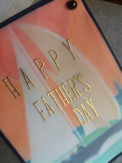
I made another Father's day card today to gear up for Father's day here next Sunday. A vintage travel poster was my inspiration for this card and I like nautical things myself too. But the thing that stood out to me was the colors of the poster. The oranges, teals, and navy blue make a stunning combo. I pinned this travel poster on my Colors board on my Pintrest page. To begin with I made a loose sketch of the poster but I simplified it.

This quick sketch doesn't do the original poster justice, but you get the idea. I was going to stitch a panel of vellum over this, but when I tried to things just went from bad to worse. In the end I had to tear apart the whole card and remake it because it got messed up so bad. But I guess that just makes new creative possibilities. I took my sheet of vellum and heat embossed Happy Father's Day in gold with Violet's ABC's stamp for my sentiment. That was a trick to make a comma since the set doesn't have one.
The vellum gives the effect of looking through a frosted window. To pull the whole card together I matted the sailboat on navy card stock and then put it on a white card base. I found some metal studs in my stash of embellishments to use. And I could hide my multi medium matte behind them and they look awesome too.. (My 19 month old son just came up and was kissing my elbow as I was trying to type.) Cards for guys are a little hard to embellish because you can't use girly thing for their cards and they do not like finding glitter on them later from handling a card you made for them.


Hope that you enjoy this vintage travel poster inspired Father's day card and that you will visit again to see more of my cards and art journal layouts. I greatly appreciate anyone that takes the time to leave me some feedback too. Thanks. 

Thursday, June 11, 2015

The Card Concept #37 The Butterfly Effect

I wanted to try a different style of card for the my entry in the Card Concept Challenge blog #37 the butterfly effect. Clean and Layered is the style of card that I am going to try my hand at today. Definition for Clean and Layered is as follows:

  • clean lines
  • lots of layers
  • designer papers / embossing
  • embellishments / accents
  • clean and fresh looking
  • some colored images at times
  • white space


I started my card with stamping three butterflies with versamark ink on white vellum and heat embossing them in white. Then I glued on my sequins with multi medium matte. While that was drying I took three colors of ink and a strip of water color paper and blended the three colors of ink in a row. The water color strip was also coated it with pink perfect pearls then when it was dry I die cut the word believe. To glue my vellum piece to the plain white card base I turned over my vellum panel and put glue behind each of the sequins, then I adhered it to the card base.
I glued down my sentiment and added a wink of stella to the butterfly wings for a final touch.  Unfortunately it is very difficult to get the shimmer of the wings to show up in the pictures.
Hopefully I achieved the look of clean and layer that I was going for with this card today. I was inspired by the butterflies, the white lines of the icing, and some of the colors. Please leave me some feed back if you would, it would mean a great deal to me if you would. 

Supplies:
Recollections 110 lbs white card stock
Recollections white vellum
Lawn Fawn' s Flutter By Stamp set
Hero Arts white embossing powder
Zig clear wink of Stella
Pretty Pink Posh peony color 6mm sequins
Simon Says Stamp moonshine mix
Artist loft 140lbs water color paper
Wplus 9's Sweet gelato, Miami spice, and Bloomsberry dye ink
Tim Holtz's Holiday words script die


Wednesday, June 10, 2015

My favorite buttons

I got my order from My Favorite Things today, hurray for paper crafting goodies in the mailbox. This was the first time I have ordered from them it was so hard to decide what to get because there are so many things to pick from and they had a new June release here lately too. I really wanted the lace background stamp but I was to late getting to it and it was sold out.... bummer. Oh, well I guess that means I will have to wait and order it later on. But one of the things I like about MFT (My Favorite Things) is that you get a free die if you order $60 worth of stuff. This month they had a cute button die that embosses too. That's what I am show casing in my card today.
I started off running a piece of water color paper through my cuttlebug, with the embossing mat (the embossing mat was also part of what I ordered from MFT) and button die. After that I water colored the  buttons each design of button in a certain color. The colors were from a color swatch that I have on one my Pintrest boards. Yes, I am a Pintrest junkie.  My husband use to give me a hard time about Pintrest till I showed him he could pin motorcycle and car stuff too. Now he has his own Pintrest account too. While the buttons were drying I took my Lawn Fawn "thanks" die cut and cut three layers of heavy white card stock and one of the dark grey swiss dot print; I stacked them and glued them all together. Then I adhered a 4.25 x5.5 piece of kraft card stock on my plain white card base. My button water color panel was also die cut with a Mama Elephant stitched border. I glued all the pieces together and trimmed it with some Coral Lawn Fawn twine. The next week or so I am sure you will get to see more of the goodies that I ordered from MFT.


Monday, June 8, 2015

Father's day fishing card


I don't know about you but I find cards for guys hard to make. It is hard because I want to add sequins, or a wink of stella (very tastefully of course, in moderation.) But I like flowers and feminine things so making a manly card is a challenge. Maybe I am just picky about what masculine stamps I like? 


I made this card for Simon Says Stamp Wednesday Challenge. Their theme this week is make it masculine. So, in readiness for Father's day I made a fishing card. The back ground is something I have done on some other cards I have posted lately. It is gessoed paper with gelatos in brown, grey, and silver blended with my finger. Then you cut the paper to resemble planks. I stamped the fishing line and fish from WPlus 9's Fish More stamp set. I love some of the sentiments in this stamp set.  The letters are die cut from Lawn Fawn's Cole's ABC's die; I die cut two pieces of water colored paper that had been smooshed with peeled paint and vintage photo. The sentiment panel has antique linen blended on it and vintage photo around the edges too.
Then to assemble the card I took a white card base (4.24x5.5) and glued down some chocolate card stock, then the planks, then the sentiment panel was popped up on white fun foam. Very last I added a some tan and white twine.


So, when he opens this on Father's day my husband will know the kids and I think, " You can tackle anything! " After all he is one incredible Daddy and Husband, we are certainly blessed to have him.

Sympathy Card Trio

Today I made a trio of cards using the same sentiment. I started with my blending tool and some of my distress inks.  The first one used mermaid lagoon, salty ocean, peacock feathers, and cracked pistachio.
I used my MISTI to stamp the tree and grass on my panel with versafine black onyx ink and used clear ultra  fine embossing powder to heat embossing them. Then I cut the panel with a circle die. After that I   dry embossed a piece of white paper with a wood grain embossing folder. I cut a strip of vellum and heat embossed the sentiment in silver Hero Arts embossing powder. To assemble my card cut a circle in my white wood panel and sandwiched the vellum strip in between the the circle and the white wood negative. Then I mounted on black piece of card stock and on a white card base.


The second card only used three colors: mustard seed, spice marmalade, and festive berries. This card was more of a clean and simple design. I sprinkled water drops on the distress ink panel and blotted away the water and let it dry. Then I stamped the lamp, lamp post, and sentiment with black versafine ink and heat embossed them with ultra fine clear Hero Arts embossing powder. After mounting this to a white card base this was completed.


 And the third card I used: dusty concord, victorian velvet, and tattered rose. I die cut the distress panel with a mama elephant die that had a stitched outline. Then I stenciled the flowers with the Tim Holtz wildflower stencil and seedless preserves  paint and silver craft paint. While that was drying I die cut a scalloped panel with another Mama Elephant die and then colored it with Copic markers. (N0, N2, N4, N6) I mounted the ombre distress ink panel on white craft foam and then adhered it the Copic grey panel that was glued to the card base. For a finishing touch I added some Simon Says Stamp moonshine sequins.

Sympathy cards are not always easy to make, but they are ver important to those that receive them. It is good to minster comfort to those who are hurting because you may never know the difference that you may make in their life simply because you were there for them.

Sunday, June 7, 2015

Watercolor Flamingo card


Welcome to my blog, on this lovely Sunday. You may have made your way here from the Pretty Pink Posh watercolor blog hop. Water coloring is one of my favorite mediums, I am by no means a pro but by I do enjoy it and I hope to learn more as I practice. Sandy Allnock has been a wonderful inspiration and I have learned things by following her blog lately.

For my card I decided to try something I haven't ever done on a card before.  I had an old National Geographic magazine laying around that had photos of flamingos in it. They have such lovely color. So, I decided to try my hand at drawing a flamingo and painting it with my set of Kuretake Gansai Tambi water colors.
 I am also hopping my card is different from anything else that you will see on this blog hop too, since my flamingo was drawn by hand and not stamped. I cut my water color panel to fit most of the front of a 4 and a quarter by 5 and a half card. After that I stamped a strip of diagonal strips with WPlus 9's fairy dust dye ink.  And I adhered it on the card base next to the water color base. My sentiment was stamped with Black Onynx Versafine ink and heat embossed with Hero Arts ultra fine clear embossing powder.
For a final touch I added some Simon Says Stamp moonshine sequins. (My pretty pink posh sequins that I ordered on there way.)  Hopefully you enjoyed this card that I made with a flamingo standing in the surf wishing someone a colorful hello.

Tuesday, June 2, 2015

Happy thoughts - art journal

So, I got the die cut from Lawn Fawn called party balloons. We have had a lot of rain lately and the gray skies have been kinda gloomy and I needed something cheerful to work on. This page has been a work of servral days, whenever I can get the time in between cooking, cleaning, and the kids.

I started off with stamping butterflies on just any old white tissue paper I found in the gift wrapping holder in the closet. The ink I used was WPlus 9's coconut husk and the butterflies was from their Flora and Fauna 2 stamp. After that was dry I glued it to my notebook page with Faber-Castell gel medium.  Right now I am just using a plain cheap notebook that I have on handle I hope to try a Dyllusions notebook in the future. After the gel medium was dry I got out three colors of distress paints: mermaid lagoon, broken china, and seedless preserves. Dabbing them on randomly and blending them with my fingers and baby wipe was lots of messy fun.
 While the page was drying I got out three sizes of balloons and five colors of distress inks. I die cut the balloons from white card stock and blended them with squeezed lemonade, spiced marmalade, peacock feathers, picked raspberry, and cracked pistachio. For the highlight on the balloons I just got a q-tip wet and dabbed the upper left of each balloon a few times. When all of the balloons and background where dry I arranged them  and glued them with Ranger's multi medium matte, but just a dot in the middle leaving the edges loose so I could get the strings under the balloons later.
Using black emborderioy thread I tied (three strands thick) a string to each balloon and fished the them behind the other balloons, pulling them tight and securing them with two staples criss crossed in a X. I stamped random  uplifting words from different stamp sets on scraps of paper and trimed them down in different shapes to scatter across the balloons. When that was done I took a scrap of water color paper and smooshed it with spiced marmalade distress ink and let it dry. I die cut the happy from the happy birthday die from Simon Says Stamp and the letters from Lawn Fawn's Cole's ABC's die. The sentiment was adhered with gel medium.
And that was my art journal layout, reminding me to have happy thoughts. I have a Pintrest art journal board if you want to check out any other of my art journal layouts. I am also entering this Simon Says Stamp Wednesday Challenge they have an "Anything Goes" challenge going on right now.

Monday, June 1, 2015

Something glided, something gold

Recently I have had a thing for a coral red with teals and blues. I think that this card kind of has an eastern feel to it. The gold embossing was perfect for Simon Says Stamp Monday Challenge and their "Royal" theme. 


The first thing I did was to stamp the leaves from WPlus 9's Spring Blooms in their Flamingo pure color ink on water color paper. When it had dried I water colored around the leaves with Peacock feathers and Mermaid lagoon distress inks and a water brush. For my background piece I took the whole distress ink pad in Antique linen and swiped it across a white paper till I had the coverage I wanted. The edge also has Vintage photo distress ink softly applied with a blending tool around it. 
All of the embossing was done with Hero Arts gold embossing powder. The leaf panel was popped up on fun foam and then the card was assembled. And for a crowning royal touch, so gold sequins for a lovely congratulatory card. 

I am trying to get involved in more challenges to stretch myself, help myself grow, and try new things. Card making gives me a creative outlet and I get to encourage others, but right now I feel a little lost. Not sure but I feel like I need a bit more direction.