Friday, July 24, 2015

"If tea cups could talk..." - Art Journal


My newest die cut that I have is my first steel rule die (I believe its is considered a steel rule die). The Tim Holtz Tea Time die; I have been eyeing this die since it came out and I finally purchased it. Part of the reason I held back from buying it was that I have a Cuttlebug machine and I did not want to have to buy a new Sizzix machine just so I could use this die. But I discovered through a You Tube video that I found on Pintrest that you can indeed use this type of die in a Cuttlebug. All you have to do is use the B plate and card stock with this die to cut out the tea cups. 


When I got this I had so much fun just cutting out the tea cup, saucer, and tea bag tag that I had to cut out more than one and play with different techniques on them. In this stack of cups I did the orange cup first. I used gelatos on it. I used two different oranges and blended it with an ink dauber (thanks, Nina and the Waffle Flower blog is where I learned how to do that) and then I shaded the edges with a red. After that I put stencil over it and removed the color a little with a baby wipe to create the dots. The blue cup was made with a light and dark blue gelato blending like the orange cup and then adding texture paste over it with the doily stencil (Tim Holtz again). The green saucer followed that same idea with the gelatos. The cup with the flower and the greenery were done using distress inks. The cup on the bottom of the stack was stamped lightly with cracked pistachio using the distress marker on the stamp then stamping and going over the stamped image with the marker to define the outline and veins. I added some antique linen with a water brush to add some shadow and age to the cup since these cups have chips and wear on them. The floral cup was painted with the antique linen and water brush first then stamped over with distress inks once it was dry.


I am entering this in the Work It Wednesday Challenge  on the Simon Says Stamp blog, their challenge theme is die cuts. I do believe that I had enjoyed myself with die cutting when I made this art journal layout. I hope that you like my project and that you consider coming back and visiting my blog again in the future. Have a wonderful day and be blessed. 


Thursday, July 23, 2015

Colored pencil on black - Sparkle and Shine

This week the challenge on Simon Say Stamp Wednesday challenge blog is Sparkle and Shine. I wanted to see how colored pencil would do on black card stock with this card, I have seen it on kraft card stock before and thought I would give this a try.

(You will have to excuse my unedited photo, I couldn't  get it  work so I put it on as is. )

I stamped some succulents as flowers and greenery for my card in white heat embossing and then colored them with my colored pencil. After that I stamped my sentiment and popped it up on a circle of 
fun foam and matted it with Juniper card stock and adhered it to a white card base. For my finishing touches I have gold, yellow, and moonshine sequins.

Supplies: 
110lbs white card base
Black card stock (CTMH)
Juniper card stock (CTMH)
Hero Arts Stamp Your Own Succulents  Stamp
Lawn Fawn Stitched circle
Mama Elephant stitched frame
WPlus 9 Hand Lettered Thanks
Prismacolor  colored pencils
Sequins
White fun foam
Hero Arts white embossing powder

MFT Summer School - Primary colors


Summer school is in session again. We have been learning about colors and the color wheel in the latest sessions of summer school over at My Favorite Things blog. You learn in grade school that there are three colors that you have to have to mix and make other colors. Those are your primary colors. 


This simple water colored card today was made with the three primary colors. But in this case I used distress inks in Mermaid Lagoon, Abandon Coral, and Squeezed Lemonade. I embossed the balloons in white and wet the panel and dropped in my colors and let them blend and mix a bit. 


Then I trimmed my panel to size to go on a 3.5x 5 card and popped it up on fun foam and mounted it on Dove grey card stock. Hope you enjoyed my home work? 

Supplies:
Dove grey card stock WPlus9
140 lbs water color paper
2mm White Fun Foam
Lawn Fawn Year four stamp (balloon)
SSS Birthday messages (sentiment)
Distress Inks: Mermaid Lagoon, Abandon Coral, and Squeezed Lemonade
VersaFine Black Onyx ink 
Hero Arts white embossing powder
Hero Arts Ultra fine clear embossing powder
SSS moonshine sequins


Tuesday, July 21, 2015

Colored pencil on kraft - Simon Says shape challenge

Simon Says Stamp Wednesday challenge  is "Get in Shape" as I don't have very many shape dies that are large enough to make a shaped card I went with a scalloped edge shape for my card today. It was a little bit of a challenge to get my 110 lb white card base through my cuttlebug to make this card but I did. We were suppose to try and use Lawn Fawn products too.  For all of my embossing I used Lawn Fawn stamps. 


Debbie Hughes had a card about week or so on her blog with color pencil on kraft card stock that also inspired my card. I masked off the area for my sentiment with some post it tape and stamped and heat embossed flowers and leaves from the Flutter By stamp. Then I colored them and die cut the stitched panel from Mama Elephant. Then I pulled off the masking tape and embossed the "Happy" with gold Hero Arts embossing powder. Then I die cut the Birthday from some white card stock and a Simon Says Stamp Happy Birthday die.  


So, this is my twist on the "Get In Shape" challenge, I hope that you enjoyed my work and that you come and visit my blog again soon to see what else I have created. 


This is where I was last night. My first ever pro baseball game. It was exciting and fun. I was blessed with some free tickets for donating blood at Community blood drive. It's kinda nice being able to donate blood to help some one else and receive an unexpected blessing in return.

Monday, July 20, 2015

Thanks - Happy Mail Animals


I got the Abandon Coral distress color set this week in the mail.  When you get new stuff you just have to play with it, you got to love mail that contains new supplies.  The thanks was die cut from a watercolor panel that was stained with abandon coral, mermaid lagoon, and cracked pistachio stain. The animals were stamped from the Happy Mail stamp set from Wplus 9, and colored with Copic markers. I have used the bear and the birds from the Happy Mail set but I hadn't really used the squirrels or rabbits yet on a project. 


I mounted it on a Dove grey card stock base and trimmed it with Coral lawn fawn trim. The white words on the black are from the Wplus 9 hand lettered Thanks. The challenge at Simon Says Stamp Monday Challenge blog is things inspired by the letter "I" this card was inspired by the letter "I" for inlay. The stained piece was inlaid into the white panel with the forest animals. 


Hope you enjoyed my card and leave me some comments please. Thanks!

Sunday, July 19, 2015

Watercolor flowers three color blend

This is a card that was inspired by a Kay Miller card that I saw on Pintrest. And it was also inspired by the MFT lesson on Secondary colors. I was inspired by Kay's colors and the flowers in the center. So, I did some ink smooshing on water color paper with Salty Ocean and Mustard Seed and it blended together to make the green in the middle.  Then I flicked it with pearl water color. 


I used the water color flowers stamp from My Favorite Things. They were stamped with Tumbled Glass, Salty Ocean, Cracked Pistachio, Mowed Lawn and Mustard Seed. Then the sentiment was heat embossed with white Hero Arts embossing powder, with Birthday Messages from Simon Says Stamp. 

The water color panel, the flowers, and sentiment were all popped up on foam. The card base is Dove grey card stock from Wplus 9.  Such a fun card to make, and I love smooshing the ink. 

Wednesday, July 15, 2015

Virginia's View Challenge with Mums

This is a card I made this week. I stamped this with WPlus 9 Coconut husk on water color paper. Then I water colored the flowers in layers and added embellishments. A very straight forward card made in my spare time so I could just relax and enjoy myself playing with paper, ink, and embellishments.  Entering this in the Virginia's View Challenge 100% stamped inspiration. Hope you enjoyed this short and sweet post and my card.

Supplies:
110lbs white card base
140lbs water color paper
Tim Holtz Stampers Anonymous Flower Garden stamp
WPlus 9 coconut husk ink
Gansai Tambi 36 count water colors
Distress ink vintage photo
Simon Says Stamp Birthday Messages stamp
Hero Arts gold embossing powder
Copper/ Brown glitter tape trim
Sequins in gold, brown, and yellow

Peace like a River - Art Journal layout

Today I have an Art Journal layout to share with you. This is in honor of Heidi Swapp. Jennifer McGuire shared that Heidi had lost one of her sons. I have never meet her or spoken to her before but when someone loses a child I can not imagine the pain and hurt that they must go through. I pray that God would bring her and family comfort and peace. 
The scene that I am try to show with this art journal page is a peaceful river with flowers fallen from the trees and floating in the water, and the water ripples gently as the flowers land on the surface of the water. 


The words on the page are from the hymn "It is Well With My Soul" there is a very profound and moving story behind the writting of that song. I don't think that I could do the story justice but I encourage you to google the song and read about the man that wrote the song and what he went through before he wrote that beautiful hymn. 
The background was done with Mermaid lagoon stain, with Broken China paint, and some Vintage Photo on the edges. The flowers and leaves were heat embossed with gold heat embossing. The sentiment was gold heat embossed on vellum and the rest of the words were stamped with black versafine ink. I used a white gel pen to highlight the ripples in the water. 
I am also entering this in the Simon Says Stamp Monday challenge the theme is anything goes. 

Friday, July 10, 2015

Copic Ballerina encouragement card

I  stayed up last night to make this card for my daughter. She has learned how to read this year and not without some tears and frustration. She tends to be hard on herself and she knows more than she thinks. I wanted her to know what a good job she is doing and that I am proud of her.
 Last night I pulled out one of my practice sheets from taking the Online Card Classes; there is a fabulous  Copic marker class they have. I like to color when I am stressed or need to unwind, so last night the kids were making me crazy, being with them only with no break was starting to wear me out. So, I decided I needed a coloring break.

 I decided to cut this Ballerina out after I colored her with Copic markers. I added a wink of Stella to her outfit and shoes, then a white gel pen to add a scalloped trim to her outfit too. My card base isWplus9 Dove grey card stock and die cut vellum scalloped panel to go between the grey and white stitched panel. Next I heat embossed my sentiment and then splattered the white panel with pearl water color paint. I glued the Ballerina down with multi medium matte. Then adhered the vellum and white panel to the card base and finished with the hearts and a tiny gem on the Ballerina.


My daughter was so excited that I made a card just for her. I hope you enjoy my card and have a great weekend.

Thursday, July 9, 2015

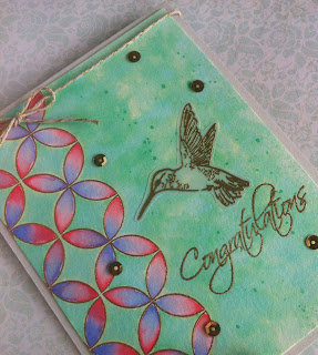
Recent favorite color trio with Congrats

For my card today I used a color combo that I fell in love with. Cracked Pistachio, Shaded Lilac, and Worn Lipstick.  I heat embossed the Quilt Prints from WPlus 9 first on water color paper. Then I used my distress inks to water color. 

 After that I heated embossed my sentiment staying with the gold as an accent color. Next I heat embossed the humming bird on vellum and fussy cut it, positioned it and glued it down. 


Then I put the panel on Dove grey card base. And for some embellishments I added gold sequins and some twine with gold thread. I am entering this in the Wplus9 throw back Thursday challenge since it goes with her wedding and congrats theme. Hope you enjoyed my card, I sure had fun creating it and sharing it.

Thursday, July 2, 2015

Art Journal - Celebrate Freedom

In anticipation of Independence day on July 4th for those in the United States I made this art journal lay out.

The colors in the picture are little bit washed out. I wasn't sure the direction I was going with this page when I first started it. The whole page was painted in distress paint with fired brick (after a gesso base of course.) Then I decided that I wanted a flag for whole page and wished that I had masked things off to begin with. But I was going to make it work and not start over on another page. I went over the red in the upper left with a blue gelato and masked off the stripes with post it tape and painted gesso for the white stripes. For the blue field I sealed it with gel medium before gluing down my die cut stars.


Before removing the mask for the white stripes I used some Antique Linen distress ink and a blending tool, I also did that on the stars before gluing them on the blue field. The fireworks and stars were heat embossed with gold embossing powder. The highlights and stitching lines were added with a white gel pen. And of course some vintage photo distress ink to frame the whole layout. I finally got myself a really art journal instead of using a regular old notebook, my goodness I should have done that sooner. It was well worth it. I am going to enter this in the Work It Wednesday Simon Says Stamp Challenge. Hope that you have a safe fourth of July with your family and friends and thank all those who help keep us free. 

Wednesday, July 1, 2015

Summer Simon Says Stamp Challenge

Summer... it goes by way to fast. I was thinking of summer roses and flowers that come after summer cool weather pansies too. My newest stamp water color flowers from my favorite things was something I keep coming back to to  try different things with and see what works. Since  Simon Says Stamp Monday Challenge is about summer I figured these cards would be good for that challenge.

 It's a little bit hard to see but a layer of the roses has been stamped with versamark and heat embossed with WOW silver embossing powder.


The roses and the sky have been done with distress inks: Salty Ocean, Tattered Rose, Victorian Velvet,   Shabby Shutters, and Peeled Paint.


These little flowers on the stamp looked little pansies so I stamped them in typical pansy colors and I used my ink to color my ribbon to match with mustard seed. I drew the centers in with a gold pitt pen. If you enjoyed my cards please leave me some comments, it is nice to know what you think. 

Supplies: 
110 lbs white card base
140lbs water color paper
 Distress inks: Salty Ocean, Tattered Rose, Victorian Velvet, Shabby Shutters, Peeled Paint, Mustard Seed, Dusty Concord, Cracked Pistachio,Mowed Lawn, and Vintage Photo
MFT Water color Flowers stamp
MFT Get Well wishes
Lawn Fawn gold trim
Wow ultra fine silver pearl
Hero Arts gold embossing powder
WPlus 9 Hand letter Hello
Paper Studio honey comb embossing folder
ribbon 

Wplus 9 Color Challenge


Today's card is playing along with Wplus9's Pure Color combination. The colors are Falling Star, Wild Mango, Flamingo, Mojito, and Appletini. I used all the colors for the challenge except Appletini since I don't own that color yet. Everyone else's  cards had florals and butterflies, so I thought I would change it up and let the sentiment be the focal point of the card. I really wish that WPlus9 had some enamel dots in some of their pure colors, I would have loved to had some in Falling Star to add to the front of this card. The hello sentiments have an ombre effect going from Falling Star to Wild Mango then to Flamingo.

Suplies:
Artist Loft 140lbs. water color paper
kraft card stock
WPlus9 's Hand letter Hello stamp
WPlus 9 pure color dye inks: Falling Star, Wild Mango, Flamingo, Mojito, and Fairy dust
Lawn Fawn's Flutter By stamp (leaves)
MFT diagonal stripes background stamp
Hero Art's gold embossing powder